Intro
Research shows that 75% of people judge a business’s credibility on its website’s design. Additionally, first impressions are formed in just 0.05 seconds and are 94% design-related.
We can see how much of a role design plays in the effectiveness of a website. In this post, we will explore what are the characteristics of great web design, that retain and convert users. This post is part of a multipart series. For part two, click here.
Simplicity
Too much information can be overwhelming for the user, be it visual or written. Instead, keep things simple and easy to read. Avoid too many animations, too much happening on the screen, too many lines, too many colors, and so on. That way, the user can immediately understand what they are looking at. It’s less straining for the brain, and results in a more pleasant experience.
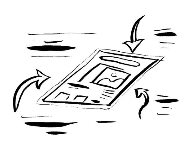
Visual Hierarchy
It is said, we have 8 seconds to grab the users’ attention before they leave for another website. As such, they need to see the most important things first in order to keep them interested and engaged.
So the first step is identifying what’s most important. Then, we have to visually separate it, so it stands out from all the other stuff. This way, the eye goes naturally to the most important elements in a page, like a CTA or a value proposition. If a user’s attention is drawn to a CTA, and they like what they see and read, they are more likely to interact.
The order of presentation also matters. Items that are higher on the priority list should be shown early on when a new user visits your site. You wouldn’t want to bog down your visitors with long paragraphs of technical details before they are even interested in what you offer.
Focus User’s Attention
Visual cues can direct a visitor’s attention from point A to point B. They can reinforce hierarchy, by making important elements of a page more prominent. They make the eye go naturally to strategic places on the screen, where key content or a button might be.
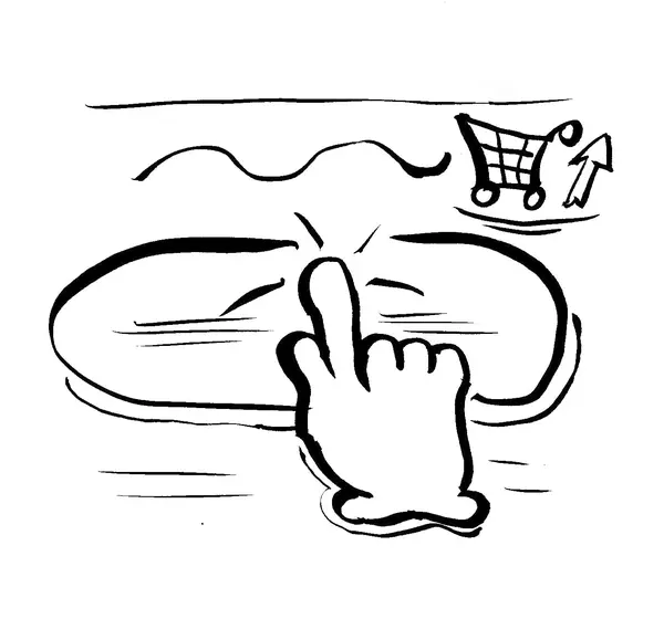
Calls to action
Calls to action (CTA’s) are elements that move users towards taking certain actions, like purchasing something or creating an account. Research shows that optimizing CTAs can drastically increase conversion rates. Here are some CTA stats:
- Personalized CTA’s convert 42% more. “Get started” vs “Start”. “Let’s Get in Touch” vs “Contact”
- Buttons with an arrow icon at the end get 26% more clicks.
- Visually Appealing CTAs get 42% more clicks.
- 70% of Small Business B2B Websites Lack a CTA.
- CTAs above the fold have 73% higher visibility.
Clear and compelling text, smart placement, size and shape, urgency, all of these need to be taken into account when designing CTA’s.
Consistency
Consistency in design is when the characteristics of visual elements are repeating from page to page. They follow the same visual language, let’s say. Think of buttons with the same dimensions and colors, headings with the same fonts and sizes, the spacing throughout the website following certain patterns, and so on.
Consistency makes your website easier to read. That is because, when patterns are repeating, the user already knows what they are looking at (because they’ve seen it before). As such, they don’t have to process it as much in their brain, resulting in a more pleasant experience.
At the same time, consistency makes your website look professional. Lack of consistency is very common among amateur websites.
Responsiveness
More than 50% of the overall users of a website nowadays are not browsing from a computer. Then, even among computers, there are vastly different screen sizes. The difference from a laptop screen to a wide monitor can’t be ignored.
A website needs to do well on all kinds of different screens, be it mobile, tablet or desktop. Even if only 1% of users are on tablet, that’s still real potential clients (or followers) you are losing when sacrificing responsiveness. It might seem a bit tedious to optimize for all kinds of screen sizes, but it’s worth it.
Visual Balance
Visual balance refers to the relations that connect visual elements, so they comprise a pleasant and easy to read whole. In plain words, it’s what makes a website look good. It is things like proportions, how well the colors fit together, how the images work together with other visual elements, and so on.
Visual Balance is a matter of feeling and intuition, as opposed to logic and reasoning. To truly master it requires visual skills that can only be learned from years of practice.
White Space
Negative space, or White space, is the empty space between elements, and It’s important for a few reasons:
- It creates hierarchy.
- It gives balance and clarity to a page.
- By reducing the amount of stuff on the screen, it reinforces simplicity.
- It makes information easier to process.
As a rule of thumb, it’s better to have plenty of white space, than too little of it. Though, too much can also be harmful. We want the right balance of white space, just enough.
Brand consistency
A website is the primary place to showcase your brand online. It would be a big miss if the design of the website doesn’t align with your brand. The visual language of the website needs to reflect your businesses ideas, feel, culture, and bring them forth.
This is a big reason why, here at Digital Tempo, we don’t make template websites. To make a template truly customized to your brand would require immense editing. Which beats the whole purpose of cost-efficiency and speed.
Copy
How a website looks does matter. But inevitably, if the users can’t engage with what they are reading, they will bounce. If they can’t find what they are looking for, they will bounce. And if they can’t understand what they are reading, they will bounce.
In fact, the quality of the copy affects user experience in many different ways. Something hard to grasp, like long sentences, or an unusual choice of words, can make the user repeat the same sentence multiple times, adding to their frustration. Poor content can make the website unprofessional. If the lines of text on the screen are too long, it strains the eyes reading it.
For a more in-depth break down, check one of our articles on copy.
Read the continuation of this post here.