Design
Desktop view
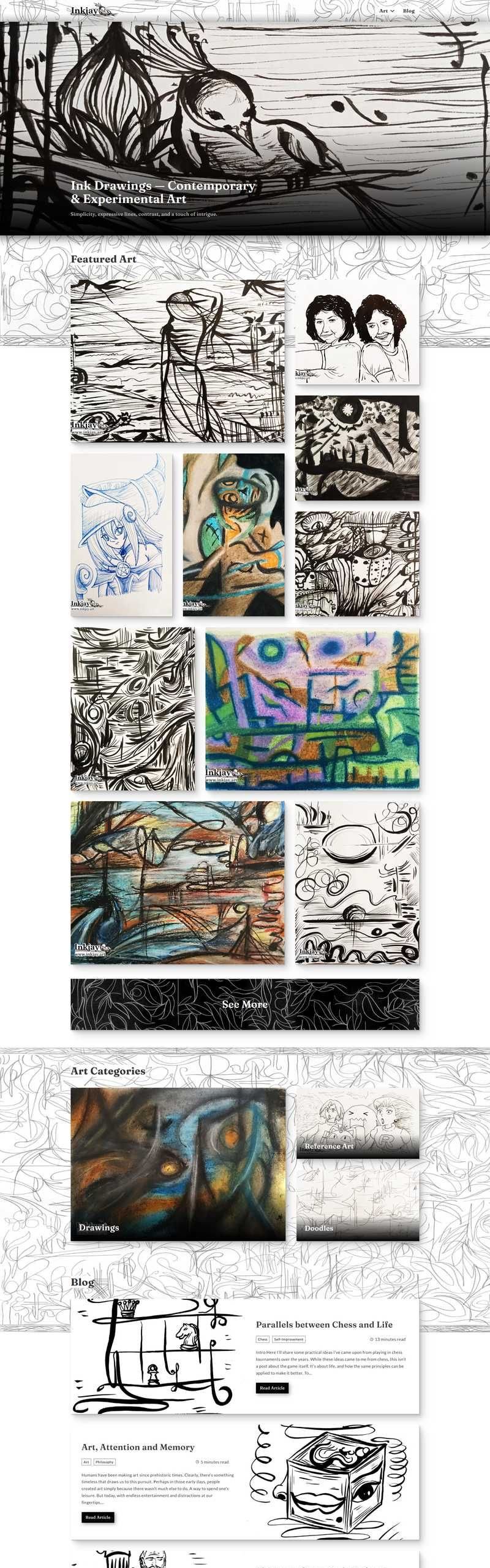
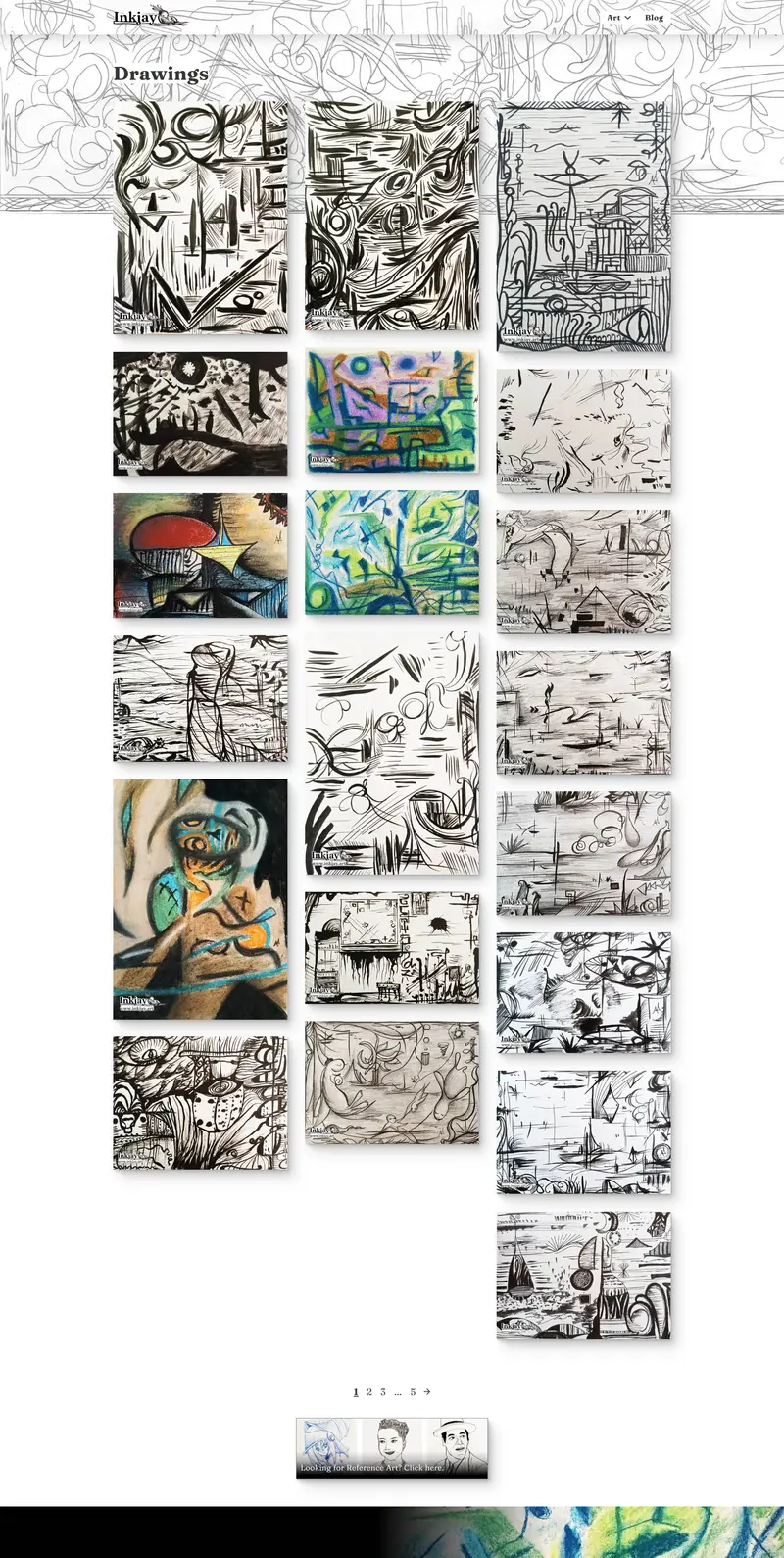
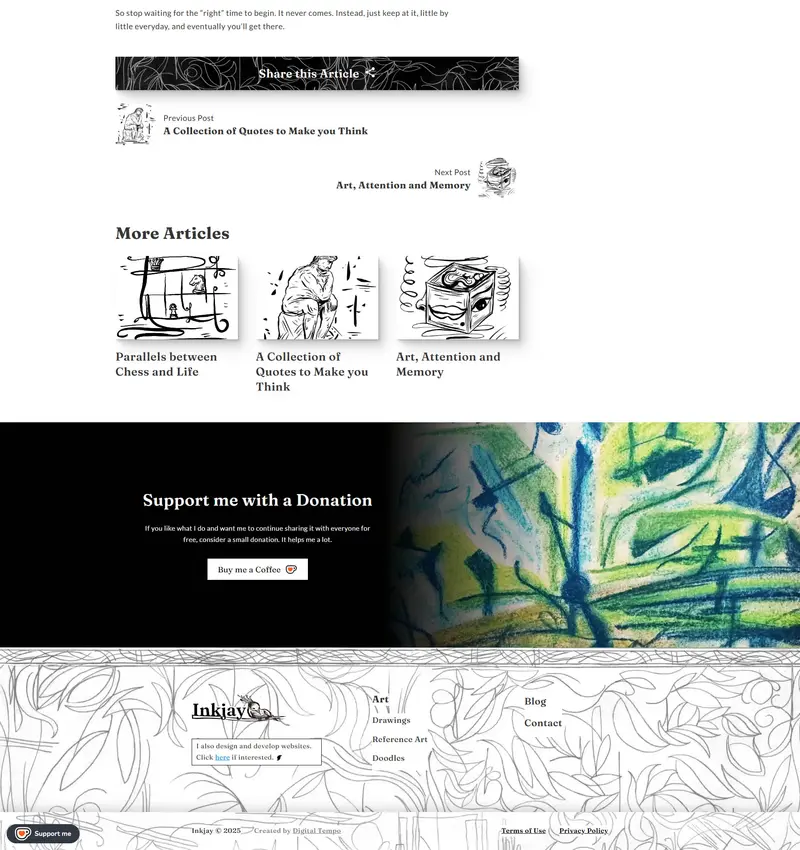

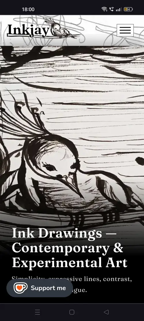
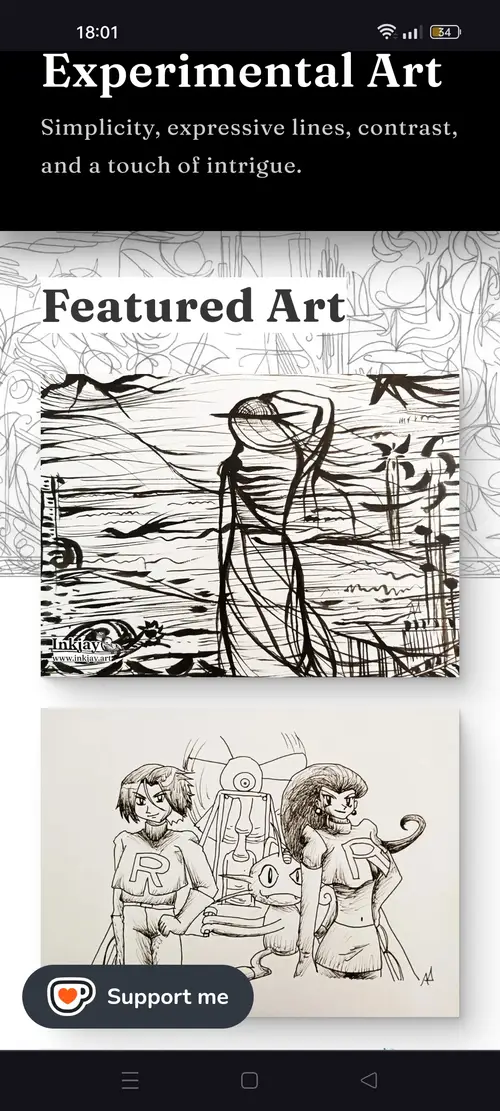
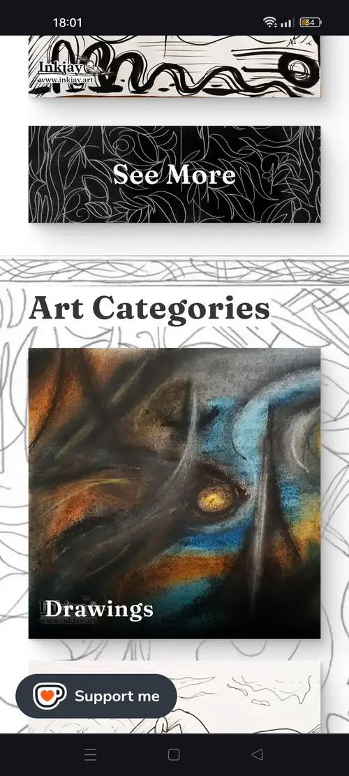
A light, minimalist style was chosen to shift the focus toward the artworks and avoid competing with them for attention.
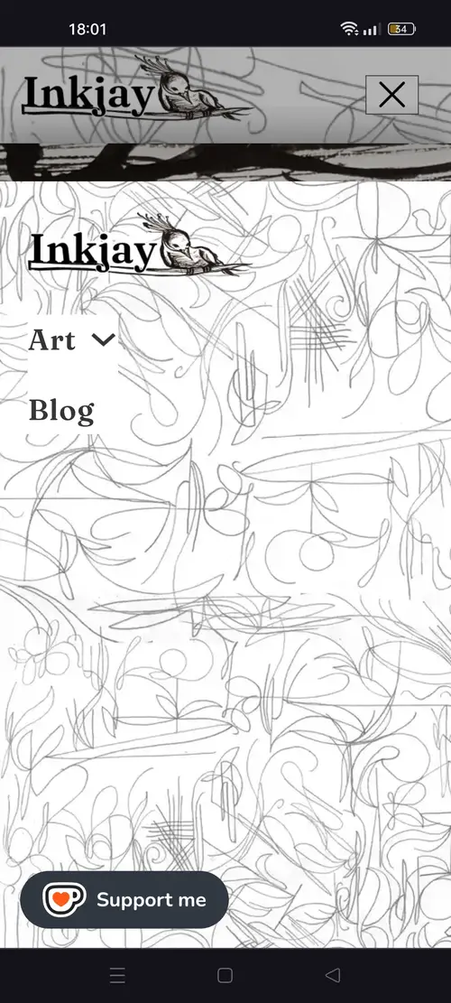
Pencil doodles were intentionally placed in specific areas, serving several purposes:
- They break the monotony of the white background and create visual interest.
- They differentiate certain segments —like the header, footer and blog section— and add an extra layer of hierarchy, guiding attention to important elements on the page.
- They reinforce an organic, handcraft feel that aligns with the traditional art style of the artist.
- This unique feel makes the website more memorable, and differentiates it from other minimalist websites.
The font choice echoes the varied lines found in the artwork, complementing them and further reinforcing the site’s organic feel.
While most of the artwork is black and white, a colored piece was selected for the CTA to draw attention and make it stand out.
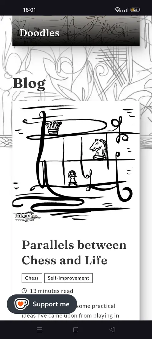
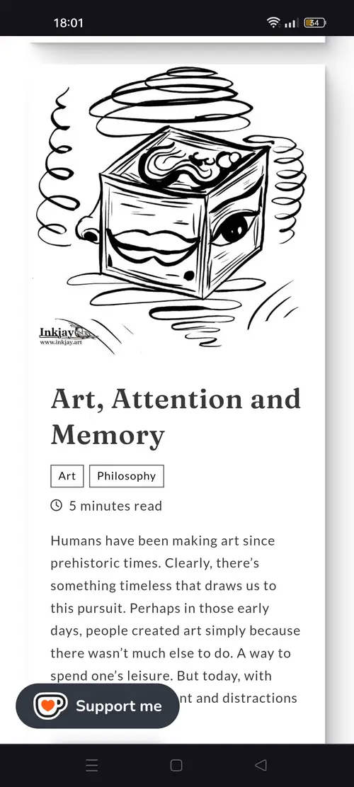
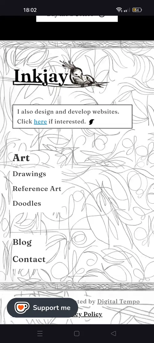
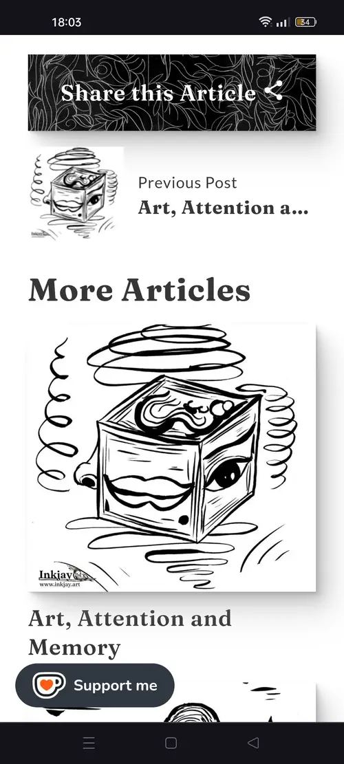
Mobile View