Intro
Landing pages go hand in hand with modern digital marketing. As the name suggests, they are the page your user lands on— typically through ads, search (e.g. Google), social media, or some other form of promotion.
In this article, we’ll explore why landing pages work so well, what elements make them effective, how good design can dramatically increase your landing page conversions, and finally we’ll take a look at a real world example.
The advantages of Landing pages
While you could use your homepage as a form of landing page—and in some cases that’s perfectly fine—customized landing pages generally convert better.
1. A single, crystal-clear focus
A homepage has to do everything at once: explain your business, showcase your services, present your brand, and lead users to different parts of the site. A landing page, by contrast, is built with a single purpose in mind: a sale, a subscription, a phone call or a form submission. Nothing more, nothing less.
This clarity is a major reason landing pages tend to convert better.
2. Perfect alignment with your campaign
A landing page should feel like a seamless continuation of whatever brought the user there—your ad, your email, your social post or your headline on Google. This makes it better tailored to the exact audience you are targeting, increasing your chances of conversions.
3. Fewer distractions
When users arrive after clicking an ad or searching for something specific, they should immediately find what they came for. No distractions and no noise, just the thing they are looking for.
Good landing pages avoid unnecessary links to other pages and keep users focused on the intended action. Sometimes they even remove navigation entirely. Every extra link is an “escape route” that draws users away from the main goal.
The Anatomy of an Effective Landing Page
A strong, benefit-driven headline
Your headline should immediately answer the user’s unspoken question:
“What’s in it for me?”
A good headline is:
- clear
- specific
- benefits-first
- aligned with the ad or message that brought them there
It sets the tone for the entire page and establishes relevance within seconds.
Compelling visuals that bring the offer to life
Whether you’re promoting a product or a service, visuals play a major role in engagement. They help users picture the outcome they want, understand what they’re getting, and emotionally connect with the solution you’re offering.
High-quality, relevant images (or illustrations) can dramatically improve retention and trust. They make it more appealing for your users to stay on the page and receive your message.
Persuasive copy that guides the user effortlessly
Good landing page copy is focused, structured, and easy to skim. It should:
- communicate the value of your offer
- highlight the benefits (not just the features)
- address pain points and desires
- feel tailored to the exact audience you’re targeting
While copy is only one component of conversion-focused design, it’s a crucial one.
Learn more about how to design for conversions.
Build trust with social proof
Trust is one of the strongest psychological drivers behind conversions. When visitors see that others have already had a positive experience with your product or service, it becomes much easier for them to take the next step.
Effective forms of social proof include:
- testimonials with real names and photos
- case studies highlighting before-and-after results
- review scores or badges from trusted platforms
- logos of well-known clients (if applicable)
- short quotes that highlight specific outcomes
The more concrete and verifiable the social proof is, the more powerful it becomes. Avoid generic praise-e.g. testimonials from “anonymous” or “Joe Doe”. Specific results or clearly stated experiences will always build stronger credibility.
Encourage action by reducing friction
Every extra bit of effort a visitor has to make—every field they fill, every moment of uncertainty they feel—reduces the chance they’ll convert. Reducing friction means removing anything that slows the user down or introduces doubt.
Common ways to reduce friction include:
- offering a free trial or a demo
- simplifying forms (only ask for what you truly need)
- explaining what happens after they click or submit (“No credit card required,” “We’ll reply within 24 hours”)
- using reassurance statements (“We don’t spam,” “Cancel anytime”)
- streamlining the layout so the action feels quick and effortless
When users feel safe, informed, and confident, taking action feels natural rather than risky.
Use incentives (sparingly but strategically)
Sometimes people need a little nudge. Limited-time offers, promo codes, bundled deals, bonuses, or early-bird pricing can give hesitant users a reason to act now instead of “later.”
However, incentives should complement your core offer—not replace it. If the discount is the only reason someone is converting, the underlying value isn’t clear enough. True urgency works best when it highlights existing value, not when it tries to compensate for weak messaging.
Keep it simple
A cluttered page overwhelms users, while a clean, minimal design makes information easier to process and decisions easier to make.
An effective landing page should:
- use whitespace strategically
- rely on clear visual hierarchy
- guide the eyes naturally to the most important parts of the page
- avoid decorative elements that don’t serve a purpose
When a page feels effortless to read and understand, visitors stay longer, engage more, and convert at higher rates.
Clear and motivating CTAs
Your call-to-action is where the conversion actually happens, so it needs to stand out visually and communicate exactly what the user will get. They need to stand out because many users scan the page quickly, and might miss them or lose seconds searching for them otherwise.
Great CTAs are:
- specific (“Start My Free Trial Today”)
- action-oriented (“Get Your Quote”)
- benefit-driven (“See My Custom Plan”)
- visually prominent (contrast, size, spacing)
- repeated in strategic spots throughout the page
Additional Benefits of Using Landing Pages
Beyond improving conversions, landing pages offer several long-term marketing advantages that make them essential tools for growing a business:
- Highly targeted messaging
You can build separate landing pages for different audiences, ad groups, or keywords, tailoring the message to each segment’s specific needs and pain points. - Better ad performance and lower costs
When your landing page perfectly matches your ad, platforms like Google reward you with higher Quality Scores—often lowering your cost per click and improving your ad placement. - Better lead capture
Landing pages can collect detailed, relevant user information, which helps with segmentation, personalization, and follow-up campaigns. - More precise analytics
Because each landing page has one clear purpose, tracking its performance becomes far more meaningful. Metrics like bounce rate, conversion rate, and scroll depth provide actionable insights. - Ideal for A/B testing
Landing pages make experimentation straightforward. You can test different headlines, visuals, layouts, or CTAs to learn what resonates most with your audience. - Scalable and reusable
Once you create an effective landing page structure, you can adapt it for future campaigns with minimal effort—maintaining consistency while saving time.
Landing Page vs. Homepage: Understanding the Difference
Your homepage and your landing pages each play different roles.
A homepage is your brand’s main introduction. It gives visitors an overview of who you are, what you offer, and where they can go next. For many small businesses—especially those with simple websites—a well-structured homepage can already function as a solid “general-purpose” landing page.
A landing page, on the other hand, is designed for a single audience and a specific goal. It’s especially useful when you’re running ads, promoting a campaign, or targeting a particular keyword or offer. Because everything on the page points toward one action, it removes distractions and makes conversions easier.
Think of it this way:
- Use your homepage when visitors may be exploring, comparing, or learning about your business overall.
- Use a landing page when you want visitors to take one specific action—without navigating through your entire website to find it.
Both have their place. The key is choosing the right tool for the right moment.
Example of an Effective Landing page
Riley – Child development app
What stands out
- The main action button appears immediately above the fold, with another version placed clearly in the header. The CTA copy (“Get Started For Free”) reduces friction by making the first step feel low-risk.
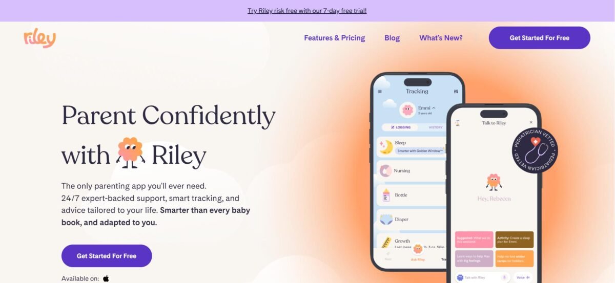
- A small banner at the top further reduces perceived risk and reassures new users.
- Social proof is established through logos of recognizable companies where Riley has been featured, as well as user testimonials.
- Text is broken into small, digestible chunks—no walls of text—and the page uses plenty of imagery to keep things visually engaging.

- Strong visuals make scrolling enjoyable and reinforce the visual hierarchy, making the page easy to scan. The copy also maintains a friendly, engaging tone (e.g., “What Parenting Superpower Do You Need Today?”), which fits the brand and keeps users interested.
- Generous whitespace and consistent design give the page an organized, trustworthy feel.
- Credibility is enhanced by highlighting the qualifications of the doctors behind the app.
- The unique selling proposition is communicated clearly across the page. It consistently reinforces that Riley is not a one-size-fits-all tool, but a complete, adaptable solution.
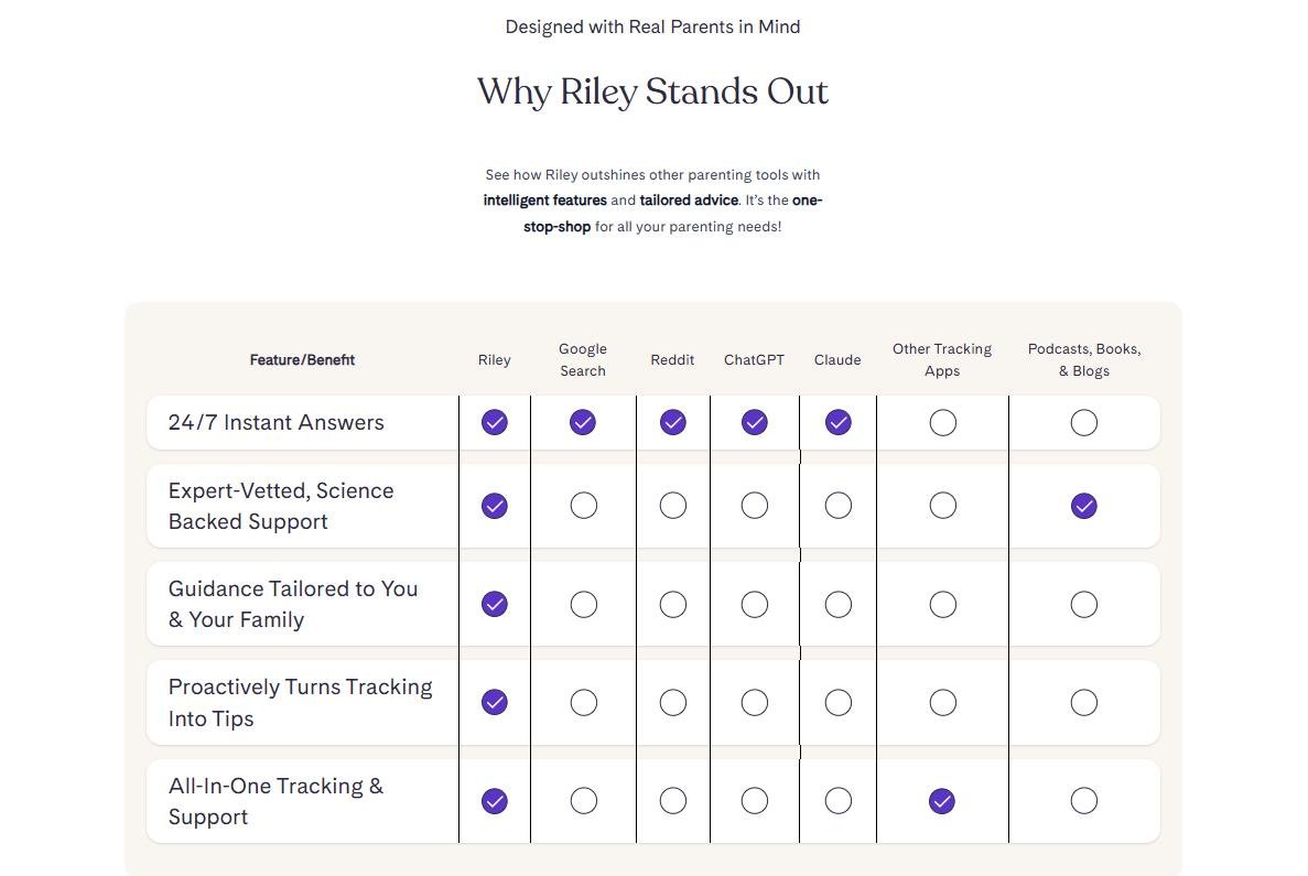
- Benefits are emphasized visually through a comparison table that positions Riley against competitors.
- A demo section showcases real examples of how the app works in everyday situations. It becomes easy to understand how the app functions and when it’s useful.
- Visuals draw attention to key sections—such as the demo and comparison table—making it more likely that users will notice the most persuasive parts of the page.
- The FAQ section addresses common doubts and pain points that might otherwise prevent users from taking action.
Final Thoughts
Landing pages succeed because they align with how people make decisions online: quickly, visually, and with a limited attention span. When a page removes distractions and focuses on a single clear purpose, the path forward becomes effortless for the user.
The goal isn’t to follow a rigid formula, but to intentionally design each element so it supports the message and removes anything that gets in the way. A strong landing page doesn’t feel complicated or pushy. It feels obvious — the user lands on the page and instantly understands what’s being offered, why it matters, and how to take the next step.
Ultimately, that clarity is what makes landing pages so effective: they create a direct connection between your goals and the user’s needs.
At Digital Tempo, we craft landing pages that not only align with your marketing strategy, but also guide attention, build trust, and encourage action. Get in touch today to explore how thoughtful design can help your business grow.